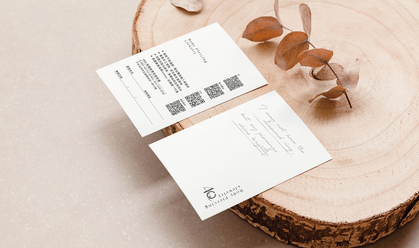


40en Body Piercing & Jewelry
40en是一個輕奢耳飾用品品牌,創辦人親自設計自家品牌logo,而我們進行品牌再造與提升,讓整體展現出一致性與精細完整的品牌識別。 本次設計目標由優化舊商標使用侷限無法加工印製的缺點。我們在線條上面稍作加粗,字母與圖樣做出適當的空間距離,讓商標本體原本只能使用在普通印刷上,修正後成可用燙金、打凸等印刷加工方式,來提升整體品牌的質感。 為了增加一致性,我們將品牌進行主要設定,包含選出品牌色與輔助色、標準字組合規範與每款小卡皆有關聯性。同時定位出品牌風格,讓品牌更有記憶點與整體規劃感,使消費者更能相信品牌本身價值。
40en is a luxury ear accessory brand. The founder personally designed the brand logo, and we are conducting a brand rejuvenation and enhancement to present a consistent and finely crafted brand identity overall. The design objective of this project is to optimize the limitations of the old trademark, which couldn't be processed or printed. We slightly bolded the lines, adjusted the spacing between letters and patterns, allowing the trademark, which originally could only be used in regular printing, to be modified to be applicable for printing processes such as embossing and hot stamping, thus enhancing the overall brand texture. To increase consistency, we established primary brand settings, including selecting brand colors and complementary colors, standardizing font combinations, and ensuring each product card is related. Simultaneously, we positioned the brand style to make it more memorable and cohesive, instilling a sense of trust in the brand's inherent value among consumers.
